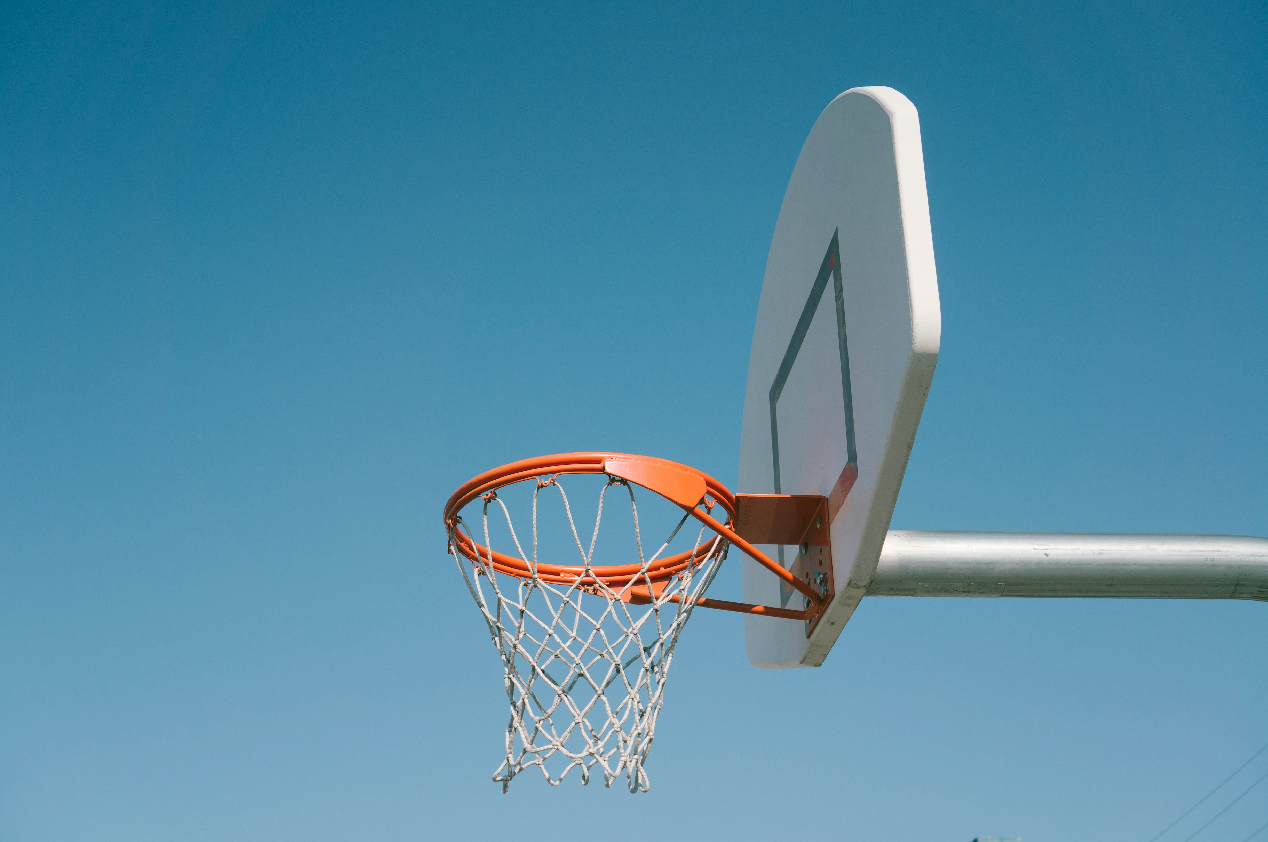
Brand colours
Scoreboard Black and Off Court White form the core palette. Swish Orange and Turf Green are accents. Use the exact HEX and RGB values below for digital work. Print conversions need confirmation with the supplier; no approved CMYK specification is supplied here.
Core colours
Use Scoreboard Black and Off Court White for clear, consistent contrast. Check logos and text against the actual footage, image or surface, especially in broadcast and changing light.
SCOREBOARD BLACK
HEX #0E0E0E
RGB 14 14 14
Print values: confirm with supplier
OFF COURT WHITE
HEX #F2E4DB
RGB 242 228 219
Print values: confirm with supplier
Accent colours
Use Swish Orange and Turf Green to support the core palette in graphics, social content and event applications. Accent C/H icons pair either colour with Off Court White C/H. Check smaller text separately for readability.
SWISH ORANGE
HEX #E86A33
RGB 232 106 51
Print values: confirm with supplier
TURF GREEN
HEX #41644A
RGB 65 100 74
Print values: confirm with supplier
Brand Typeface
Aoi Mono is the Clubhouse display typeface. Use it for graphics, titles, scores and short headings where its distinctive character can lead.
Keep scores, names and event details easy to read on social graphics and broadcast overlays. Check spacing, contrast and legibility at the final display size.
Inter is the supporting typeface for body copy, captions, navigation and longer information. The website and guide may use Inter for interface headings. Never use either typeface to recreate the logo artwork.

Weights
The kit includes Aoi Mono Compact, Standard and Extended. Match the cut used in the approved application. Inter Regular and Inter Light are the supporting weights shown below; choose a weight that remains clear at the intended size.
Create hierarchy through size, weight and spacing. Keep the available font styles intact rather than stretching, slanting or artificially emboldening the type.
Aa Bb Cc Dd Ee Ff Gg Hh Ii Jj Kk Ll Mm Nn Oo Pp Qq Rr Ss Tt Uu Vv Ww Xx Yy Zz (0123456789) / ? ! . ; : “ ‘ | $ % & *
Inter Regular (body copy and interface text)
Aa Bb Cc Dd Ee Ff Gg Hh Ii Jj Kk Ll Mm Nn Oo Pp Qq Rr Ss Tt Uu Vv Ww Xx Yy Zz (0123456789) / ? ! . ; : “ ‘ | $ % & *
Inter Light (larger supporting copy)
Aa Bb Cc Dd Ee Ff Gg Hh Ii Jj Kk Ll Mm Nn Oo Pp Qq Rr Ss Tt Uu Vv Ww Xx Yy Zz (0123456789) / ? ! . ; : “ ‘ | $ % & *
Using typography
Build clear, consistent layouts with these practical typography principles.
While these rules are proven and sound, sometimes we break these to best communicate in certain circumstances. Please contact our brand team if you wish to gain special use permission.
1 – Start with left alignment
Use left alignment for paragraphs and information. Short display headlines may follow the composition, as long as they remain easy to read.
2 – Create clear hierarchy
Use a clear difference in size or weight between headings and supporting text. Make the most important information easiest to find.
3 – Align X-Heights or Baselines
Whenever you place text next to each other, either align the baselines (the line that the bottom of a lowercase x sits on) or align the x-heights (the top of a lowercase x). This helps align each line visually.
4 – Watch The Rag
Keep the ragged edge of paragraphs balanced. Adjust the wording or text width to avoid awkward shapes and isolated single-word lines.
5 – Give Things Space, If Needed
Group related information and give separate elements room to breathe. Keep scores, dates, names and calls to action clear rather than crowding them together.
6 – Keep Line Length Reasonable
It is easy for the user to get lost in long lines of text, and short ones are easily ignored. It’s best to keep lines between 45 and 70 characters long, depending on the size of the font. This will ensure legibility as the font sizes increase or decrease.
Photography / Videography
Show the action, people and atmosphere of sport. Use clear, well-composed photography and video that keep participants at the centre. The images below illustrate composition and sporting detail; use the current Clubhouse galleries and highlights as the reference for event coverage.



Grids
Use consistent columns, margins and spacing to align headings, images and information. Keep the layout simple and adapt it to the screen or format. The grid below illustrates alignment; it is not a fixed specification for every application.
